Facebook Twitter Pinterest RSS Feeds The Weekly Post - The Official GiftsIn24.com Blog

Distinctive Handwriting Inspires Original Typeface

Embossed Graphics has developed many original typefaces.

Sally Script typeface was developed by Embossed Graphics in the late 1980s.

Giftsin24’s parent company, Embossed Graphics, has designed many original lettering styles over the years. In a previous post, we profiled “Anthony.” Today, we highlight another original typeface: Sally Script.

Do you or someone you know have a distinctive handwriting style? That’s how Sally Script got its look and its name. Embossed Graphics CEO Richard Pauling helped develop this lettering style in the late 1980s.  He based it off the handwriting of a good friend.

Font Inspired by Handwriting

“At that time, we acquired new software that enabled us to branch into new looks with our own in-house designed typefaces,” explains Richard. “I had a friend named Sally Kopp Richardson who had an interesting handwriting style.  She provided us with all the letters in the alphabet, and all numerals, too.”

A smart college intern turned her paper and pen letters into digital files, using the new software. And a new lettering style was born.

“Sally Script has always been popular because of its folksy, slightly imperfect appearance,” says Richard.

Sally Script’s round O’s and other characters give it a generous, relaxed feel. Look for it on our Sally Script Embossed Card and other Giftsin24 products.


Exclusive Giftsin24 Lettering Style

Embossed Graphics creates new typography, such as the Anthony lettering style.

Anthony Memo Square with CrystalClear Holder

Today we have a little Typography 101 for you. Put simply, typography is the design and use of typefaces. We use typefaces to communicate visually. Typefaces are powerful. They can convey emotion. That’s why you prefer some typefaces over others when you make stationery at our website.

Designers create typefaces by including many elements that make them unique and identifiable. They pay attention to things like how straight or round a g is at the bottom. Or how high or low a line crosses a t. In addition, the little feet that go at the ends of letters are called serifs. Many typefaces have no serifs at all.

The history of typography moves from old-style calligraphy to today’s digital type. Believe it or not, the first handwritten letter forms still inspire today’s typography.

Giftsin24 offers exclusive lettering styles from Embossed Graphics. EG’s skilled designers use them to create some of the most elegant personalized stationery available today.

Anthony is our Most Popular Lettering Style

This is why we’re proud to showcase our most popular lettering style . . . . Anthony. Anthony is a casual, yet graceful lettering style that feels like handwriting.

According to Ryan Monahan, Giftsin24’s graphic designer, “Anthony is a typestyle created to capture the traditional flow and stroke of a true hand lettering. The combination of the cursive and roman aesthetic really lends itself to having the appropriate movement and rhythm that many look for when trying to represent a hand written look and feel.”

xm43d_Anthony_7_Tablets_With_Holder_Notepad_Right

Because of its casual appeal, Anthony is a best-selling choice. We offer it in notes, cards, napkins, cutting boards, mason jars, ornaments and memos. Customer favorites include the Anthony 7 Tablet Set, the  Highland Memo Square and the Anthony Studio Card. These items are very popular gifts.

Embossed Graphics is the leading maker of social stationery in the country. Giftsin24 offers exceptional quality at affordable prices. Best of all, we offer super fast production and free FedEx ground shipping. In fact, most orders ship in 24 hours.

Classic Embossed Monograms

Nothing says quiet sophistication quite like classic a embossed monogram. Giftsin24 has a large selection of monogrammed notes and cards to choose from. We have traditional script monograms, classic initial monograms and eclectic, artistic monograms. All of our monograms are deeply embossed and showcase your initials in delicate detail. Whether you personalize a foldover note or a flat-panel card with your personal initials, you will appreciate the fine quality and exceptional beauty of our monograms.

Classic and refined. The perfect embossed monogram!

Classic and refined. The Classic Frame Note has the perfect embossed monogram!

Choose from a prominent 2 ½” size monogram or a traditional 1 ½” monogram, embossed borders and frames, and multiple paper colors. Our paper is smooth and thick – a pleasure to write on. You will truly enjoy corresponding with these luxurious papers!

Need help choosing? Here’s a little Monogram Etiquette 101:

• Couples – The monogram will be the bride’s first initial, the couple’s last name, and the groom’s first initial, in that order. For example, Mary and John Smith would be M S J.

• Women – A woman’s monogram is traditionally presented as first, last and middle initial. So Mary Elizabeth Jones would be M J E. It is always appropriate to use a woman’s initials in this way, even if married; however, it’s more common to use her first, maiden and married surname if she does marry. For example, Mary Elizabeth Jones Smith would then be M S J.

• Men – A gentleman’s monogram is often done in first, middle and last initial order. John Andrew Smith would be JAS. In this instance, the initials are all the same size. You may also choose to put the gentleman’s surname in the middle, as J S A, with the center initial larger in size.

"Embossed

• Children – A child’s monogram follows the traditional first, last, middle initial order.

As with any monogrammed gift, you will want to consider the age and tastes of the recipient – traditional, modern or whimsical.

The sculptured look of embossing has a timeless appeal. It’s a classic that never fails to impress. Browse our selection at Giftsin24.com today and find the perfect gift for every occasion.

New Monogram Designs

Here at Giftsin24, we’re always working to offer you the most exciting stationery designs. That’s why our graphic artists strive to create beautiful monograms and one-of-a-kind  lettering styles. In fact, this month we’re so pleased to offer four new monogram notes in raised ink – Whitlock, Elise, Paris and Firenze Monogram. Each is a work of art. Intricate swirls and eclectic letters combine to create stunning monograms.

New monogram designs include the Whitlock Note in raised ink

Victorian inspired and regally impressive: Whitlock Note in raised ink.

Victorian typography inspired the royal and impressive  Whitlock Monogram.

Dream of the sunny Mediterranean and correspond with the Firenze Monogram note, where Italian flair meets American ingenuity.

Or showcase your joie de vivre with the graceful Paris Monogram note.

Our New Monogram Notes Make Beautiful Gifts

A new monogram note is the perfect gift for the writer on your list. We offer each set of notes on smooth, luxurious paper in a choice of 10 glossy raised ink colors. We include 50 matching envelopes. To add even more luxury, we wrap your order in tissue and nestled it in a champagne colored gift box. The presentation is as beautiful as the stationery itself.

Sienna Note: a new monogram note in raised ink.

Giftsin24 is the leading manufacturer of social stationery in the country. Combined with our exceptional quality and manufacturing, we produce the very finest in personalized writing papers. Furthermore, we offer you amazing stationery at affordable prices. In addition, you can take advantage of our fast production and free FedEx ground shipping for all your gift-giving needs.

Logo Logistics: What Goes into Redesigning a Logo

the new giftsin24 logo

After the logo was designed on paper, it was created as digital vector art.

You know how you feel when you get a new haircut or a new suit, or even when you paint your bedroom a new color? You have that exciting sense of feeling refreshed and pulled-together and that, finally, everyone is able to see the real you. That’s how we feel about our new logo for Giftsin24. Have you noticed it?

Ryan Monahan, Giftsin24 designer, and Richard Pauling, Giftsin24 president and owner, worked together to design the new logo. We talked to Ryan to get the inside scoop on what went into designing the new logo, its typography and what’s next.

G24: What was your main goal with the new design?
Ryan: We wanted to update our logo without straying too far from the original design. We knew we wanted to use a serif typeface (the kind with “hooks” at the ends of the letters) and we wanted it to reflect an older, Roman typeface. To me, this logo looks literary and traditional. It implies learning and education. You might see this kind of lettering on a bookstore window.

illustration and sharpie pen

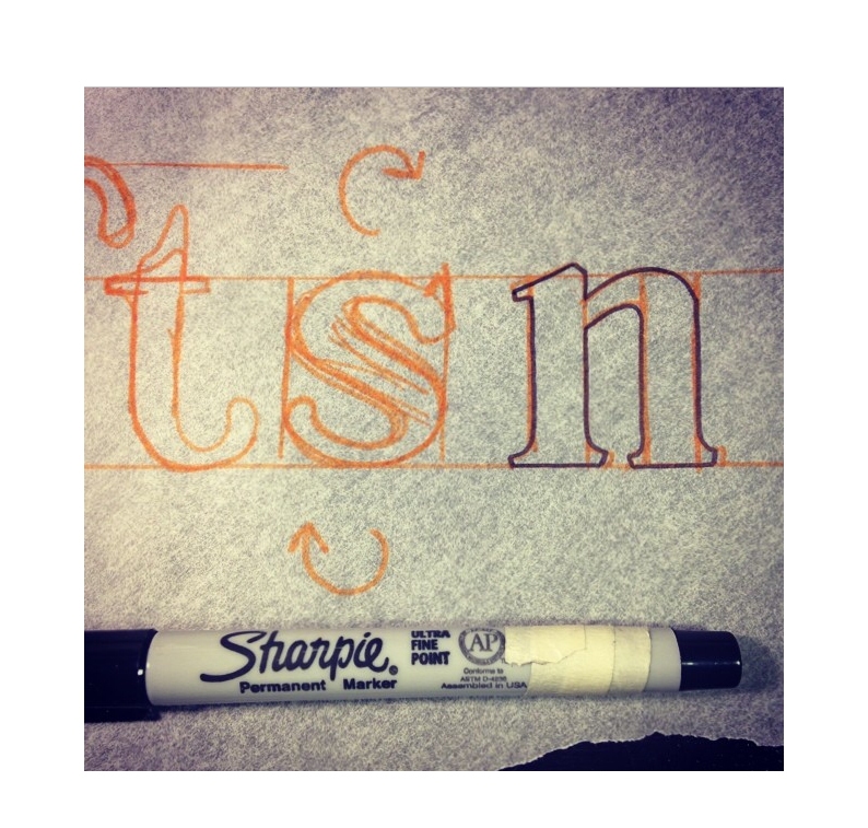
An early version of the logo shows Ryan’s thought process as he crafted the new lettering

G24: Tell us about how you designed the new logo?
Ryan: We made the lettering here in-house. We established the main concept relatively quickly. Then it took a little longer to decide on the silhouette and polish it. In total, I hand drew about 20 different concepts and variations on paper. Next, we converted it to vector art, so we could use it on the website. A vector image is made up of tiny points. Most logos are vector art, so that you can blow it up as large as a billboard or shrink it to the size of a business card, but it won’t lose quality. On the other hand, pixels make up a raster image (like a cell phone photograph), and that image loses quality quickly if you try to make it larger.

We G24: Anything special about its characteristics?
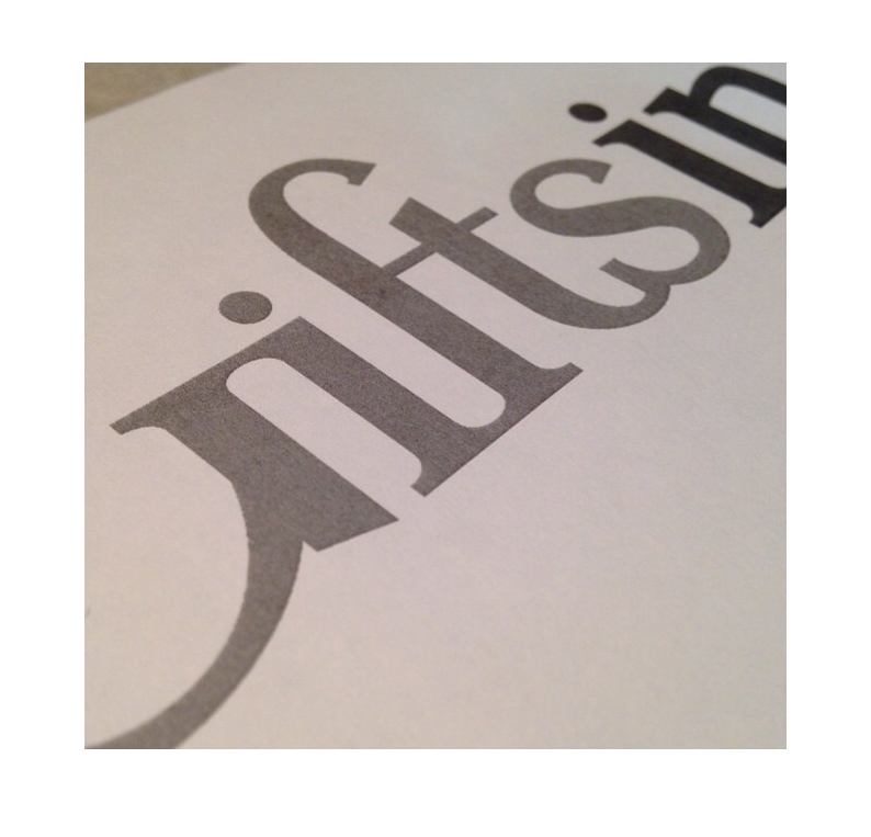
Ryan: I made it a point to include ligatures: those are typically two adjacent characters that are joined together. When you write the word little, you might use a ligature to connect the two t’s. Here, three letters join, the F, T and S, which is a bit unusual and unique. Another thing you might notice is that the lettering is fairly vertical. You can see this especially in the G. The letter G can be very round and bulbous. We made ours more condensed, more vertical. We also condensed the numerals 2 and 4 in this way. Finally, a dot above the letter i is called a tittle. We put it uncharacteristically low, very close to the top of the i. We like that style.

G24: What’s next?
Ryan: This new iteration retained the same brown and navy colors of our old logo, but we have been discussing changing the logo colors at some point, but I’ll let that be a surprise.

the new logo for Giftsin24